Colour and character
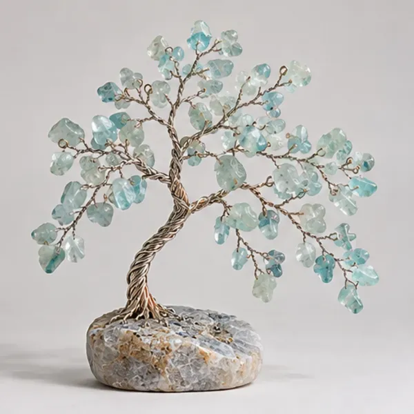
An aquamarine tree offers colour quietly. Pale blue-green chips sit on an open crown, with small cloudy and clearer areas changing the way light passes through the branches. The slight lean in the silhouette gives the design movement without making it seem unsteady. A simple base and visible trunk let the canopy remain the focus. It is a good decorative direction for someone who prefers a gentle mineral palette to a strongly saturated blue or a dense, dark crown.
Enjoying the gemstone palette
Aquamarine’s appeal is often in subtle colour rather than an intense blue impression. In small chips, the background and available light can make those tones more or less noticeable. Compare the whole tree in ordinary room light as well as the detail of the individual pieces. No premium grade, untreated status or place of origin follows simply from a pale blue picture; those are separate item-level matters.
An easy place to display
Cream, pale grey and light wood can make the tree feel part of a calm arrangement. A slightly darker object behind it may define the chip edges without overwhelming the colour. Keep the display stable and away from drinks or repeated handling. Apatite offers a stronger teal comparison, while amazonite adds a more opaque blue-green palette. The three can be considered as different visual directions rather than ranked by colour strength.
Personal meaning
In contemporary crystal symbolism, aquamarine is often connected with calm and openness. A tree can represent a new beginning, a growing conversation or simply a place that feels considered. That is personal meaning rather than an assured effect. For a gift, the recipient’s fondness for pale blue or waterside colours can be a more useful starting point than a list of promised benefits.
Care for the whole tree
Protect the branch clusters from knocks and keep the complete assembly away from heat. Use a soft dry brush for routine dusting and support the base. Do not assume a cleaning method suitable for a loose gem also suits the wire, finish and fixing. Move the tree carefully instead of repeatedly adjusting the same branch to catch a reflection.
Questions about this design
Is stronger blue always more attractive?
Not for every display. A subtle blue-green palette can suit a light room particularly well. Choose the effect you enjoy rather than assuming that saturation alone determines appeal.
How can pale chips remain visible?
A simple medium-tone background or a nearby darker book can define their edges. Avoid busy patterns and harsh glare, and look at the tree under ordinary room lighting.
How does it compare with apatite?
The aquamarine direction here is pale and airy, while apatite is selected for a stronger blue-to-teal impression. Construction and crown shape matter alongside colour.Explore this tree in more detail